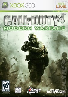
Infinity Ward, the developer behind Call of Duty 4: Modern Warfare, is up against it. It really just can't decide which box art to use for the finished game, so it's thrown the decision out to the gaming public. Out of a sense of responsibility, SPOnG implores anyone reading this who struggles with difficult decisions to stop here for their own good.
On the game's official site, Charlie Oscar Delta, the following announcement appears:
A look over the different pieces of box art below will show you just how tough the decision is. Do you pick exact-same-piece-as-all-the-others Number 1, with a close up, or exact-same-piece-as-all-the-others Number 3, with the smokiness. Infinity Ward has washed its hands of it, so it's up to us. Time to stand up and be counted, folks. We've got our boys to think about here. Well, America's boys, anyway.
You can find out more about Call of Duty 4: Modern Warfare on SPOnG's dedicated game page. When you're feeling all clued in, you can vote here.
On the game's official site, Charlie Oscar Delta, the following announcement appears:
"Developer Infinity Ward decided to involve the Call of Duty community in making one of the biggest decisions for Call of Duty 4: Modern Warfare ... the box art. Yup, Infinity Ward wants your opinion on what art will grace the CoD 4 cover and ultimately sit on retail shelves. Their art department created five different box art concepts to choose from (Alpha, Bravo, Charlie, Delta, and Echo) and are looking for the community to comment, vote and make any suggestions for their favorite box art."
A look over the different pieces of box art below will show you just how tough the decision is. Do you pick exact-same-piece-as-all-the-others Number 1, with a close up, or exact-same-piece-as-all-the-others Number 3, with the smokiness. Infinity Ward has washed its hands of it, so it's up to us. Time to stand up and be counted, folks. We've got our boys to think about here. Well, America's boys, anyway.
You can find out more about Call of Duty 4: Modern Warfare on SPOnG's dedicated game page. When you're feeling all clued in, you can vote here.
Read More Like This
Comments
I'd say number three or four. One and two seem a bit washed out.
2 has the best composition, more tension in the image than the other compositions and better contrast than number 1.
So 2.
So 2.
id say number 3 it has more of the single plum floating in purfume in an upturned bowler hat appeal.

