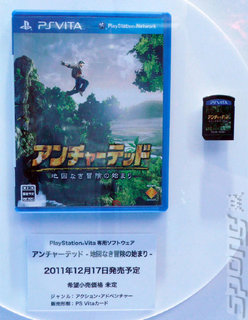
Want to know what kind of environmentally unsound method Sony will be using to package its PlayStation Vita games? The company showed off an example at the Tokyo Game Show this week, and as you can expect it looks like a tidy waste of space.
Sony's clearly gunning for a bit of Blu-ray synergy with its Vita packaging approach, opting to use blue plastic cases and the familiar PlayStation strip at the top of the game's artwork.
It seems to be the same size as a Blu-ray box, but without a reasonable comparison we can't be too sure. Look at the size of the game card that the case contains though! Could the case afford to be a little bit smaller? At least, for the sake of our already stacked shelves full of games?
Hat tip to Andriasang
Companies:
Sony
Read More Like This
