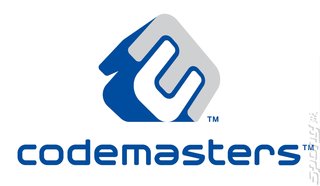
Codemasters Reveals Dynamic New Corporate Identity
Codemasters today unveiled a new corporate identity that will be introduced across the company.
Codemasters, a premier developer and publisher of critically acclaimed video games, today unveiled a new corporate identity that will be introduced across the company. The identity will be consumer facing with placement in-game and across the company�s packaging and marketing materials.
Rod Cousens, Codemasters� C.E.O. says,
�The new Codemasters logo is bold and enigmatic and its introduction is a further milestone in the progress of the company. Much like our in-house talent, the new logo can flex its creative muscles. It doesn�t have a set colour; it may appear in a wide range of colour or tonal combinations. To that end, it�s a logo that always has an element of the maverick about it, which reinforces the creativity and playfulness of Codemasters as a whole.�
The identity was developed in association with Branded, the leading strategic brand consultancy, with the logo and type realised by Clinic, the creative communication specialist. The new design will be seen on titles for release in June, including Hospital Tycoon� (June 7th, PC) Colin McRae: DIRT� (June 22nd, PC and Xbox� 360 video game system from Microsoft�) and Overlord� (June 29th, PC and Xbox 360).
Says Nicola Hewitt, Director, Marketing, at Codemasters:
�The identity can have different moods, depending on whether it is working or playing. When at work, such as corporate literature, it is very sophisticated, confident and businesslike.
�However, when it is at play and being creative, on packaging and marketing materials, it�s out to have more fun, try new things and to be enjoyed by everyone who comes into contact with it.�
Continues Cousens: �We thank all at Branded and Clinic for their contribution to evolving the design and philosophy of Codemasters� refreshed identity. This is the identity that pushes against other logos in the industry; one that helps define Codemasters as different. It�s Codemasters� logo, but can offer something different every time it is used.�
Companies:
Codemasters
People: Nicky Hewitt Rod Cousens
Games: Colin McRae: DiRT Hospital Tycoon Overlord
People: Nicky Hewitt Rod Cousens
Games: Colin McRae: DiRT Hospital Tycoon Overlord

