When Sony announced a successor to the PlayStation Portable, questions were raised regarding its biggest rival in the portable gaming space. Nope, not Nintendo, but Apple.
The arrival of the iPhone and iPad, with its accessible operating system and media convergence, dramatically changed the handheld landscape and what consumers now expect from a portable device. Sony and Nintendo seemed slow to react to this change.
But you should never count an old hand out before time. From my hands on time with the PlayStation Vita, it really does seem that Sony has not only learned from past mishaps with the PSP, but has also taken a few cues from Cupertino in terms of interface. At Sony�s huge Vita shindig this week, I was able to try out the hardware, some elements of the firmware and a range of launch titles to boot.
The Handheld
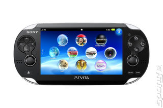
When you compare the size of the Vita against an iPhone or even the PSP, visually it seems massive. Hold it in your hands, however, and it�s a different story. Unlike the cramped dimensions of Sony�s portable predecessor, the Vita actually feels quite snug around your hands (well, my regular-sized hands at least - your mileage may vary, particularly if you have gorilla hands and/or moaned about the Xbox S Controller).
The D-pad and the face buttons have shrunk just a little bit in order to make space for that beefy 5� screen, and the cute-looking dual analogue nubs feel great to use too. In fact, despite fears of the contrary, my use of the thumbsticks didn�t result in the same kind of awkward thumb cramp that has cursed me since the first day I purchased my PSP. There�s no danger of contorting your thumb to be triple-jointed just to have the benefits of analogue play. I�ll have to check it out for an extensive play period to see if that remains the case throughout a single charge, but generally speaking it feels pretty good.
As for the screen? It�s gorgeous and mighty impressive in its resolution and size. Just like the PSP before it, the Vita display is incredibly crisp and blares out some beautiful images. What�s more, it doubles as a touch screen - and it�s quite a competent one too. I was very worried that Sony would suffer the same curse as a boatload of Android smartphone manufacturers, in terms of noticeable touchscreen latency.
Happy to say this isn�t the case from my experience - games were very responsive to my commands and the Vita OS glides around with ease at the simplest drag of my finger. The only point where I was having a bit of trouble was in sliding left and right from the Vita�s main menu to the Live Arena section.
There�s a touchscreen on the back - which thankfully doesn�t impact your gameplay experience if you leave your fingers to comfortably rest on it - but I still need to be convinced as to how useful it really is. Games like Little Deviants, where you pinch the front and back touchscreen to ping ball-shaped characters around a play field, offer sparks of genius that validate its existence, but elements such as climbing vines in Uncharted are somewhat less convincing. I hope we end up seeing some real innovative uses here.
The OS
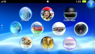
I had a little snoop around the system software that will replace the Xross Media Bar in the PlayStation Vita, and it�s quite nice indeed. Bubble-shaped icons represent different applications on the screen, which bob up and down happily as you peruse your software library. System apps are generally sat on one screen, but you can use the touch screen to swipe down and reveal additional programs that you�ve downloaded.
Selecting one of these will send it to the Live Arena, which can be accessed by swiping from right to left. This shows you details of the game that you�re playing, along with other open apps. You can have several of these apps open at the same time and can switch between them at will using the PlayStation button. Some, like Twitter, will allow you to resume your game afterwards, but others like Movies will require you to close the game you�re playing.
There are some really nice cues from iOS in terms of how the system operates - right down to the fact that you�ll find yourself using the touch screen for navigating everything whilst in the home menu in fact. Clicking the Power button whilst in standby will bring up a nice minimalist clock along with a classic XMB-style wavy background. It�s sat in a box with a tag on the corner - you peel it back by dragging the corner with your finger to reveal the main menu. Very nice. You can remove apps from the Live Arena in a similar fashion.


