You would think that Fable III, one of the big titles hitting the Xbox 360 this Christmas, would have been better publicised by Lionhead than a mere trailer on Microsoft's E3 stage. Luckily, a demo featuring both exploration and combat was present on the show floor, and at a recent post-E3 event I managed to get a little playtime with Peter Molyneux's latest.
The first thing you notice is just how familiar everything is. Following from the events of Fable II, you play the grown-up son of the previous game's hero, giving you a clean slate to act on your good - or evil - tendencies.
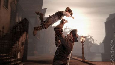
The city of Albion is intact for the most part - the only differences being those that time has thrust onto the land. While Fable II was a bit more medieval in style, Fable III is much more modern, focusing on the role of the monarchy and the people that live in it.
Ultimately, your character can overthrow the big bad boss and end up ruling the land as king. How often you then venture out to do quests is up to you, but according to Molyneux doing too much or too little can have some as-yet unknown consequences. But we can hazard a bit of a guess. Rebellion, anyone?
Brighthall in particular looks exactly the same, yet very different at the same time, thanks to the population of town and the advances in technology. One thing that Lionhead seems particularly proud of is that when shopping at a market, you can see the food or object you're perusing right there on the table, instead of within a menu. Lovely.
Other slight graphical changes - bar the obvious texture and polygon upgrades - include framerate improvements and a streamlining of the HUD. With the latter, talking to someone will have contextual buttons floating above their head rather than stuck in a corner.
There's also a huge difference in the pause menu. Specifically, that it's not a menu any more. Hit the start button, and you'll be whisked to a circular room known as the Sanctuary, where you can inspect the world map in more detail than in Fable II due to an interactive model that sits in the middle of the area. Different doors lead to customisation options including clothing, weaponry, settings and achievements.
It was created to help make the game flow better, but I didn't have time to try this menu in combat, where you will want to be swift with your commands. Speaking of combat, the demo led me to a foreign land named Aurora, whose black and shadowy evil monsters threaten the land of Albion.
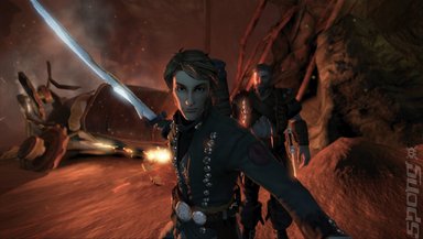
You travel through dark and dingy caves with your mentor, Sir Walter Beck, smacking the hell out of ghostly black apparitions with my trusty sword and firearm combination. As I beat more enemies, the familiar yellow breadcrumbs trail would lead me further into a long-abandoned temple, until Beck gets captured by the darkness and you have to rescue him.
As you would expect, battling foes is as you found it in Fable II - the X button performs mel�e attacks, while the Y button uses your long-range weapon. Magic spells are cast with the B button, with more powerful attacks cast by holding the button down. Holding the left trigger can allow you to change your otherwise automatically locked-on target. It's still a bit janky in this regard.
As mentioned before, Fable III takes advantage of a smoother framerate than it's predecessor, but even playing through this dungeon I found instances of slowdown. The game still has a way to go yet before it's October release, so let's hope that gets tightened up - it was one of the only bugbears of Fable II.
Until then, know you're getting an experience not unlike what you're used to here. That familiarity is a good thing, and hopefully the other elements that could make the game a worthy successor - the monarchy system and Kinect capability to name a couple - does the Fable series proud.


