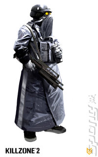
Following the first in-game Killzone 2 screenshot finding its way onto the good old internet yesterday, Sony has released a few new morsels with which to tease us.
Below you'll find three new screens along with a couple of arty treats. Call us lazy, but SPOnG reckons that if we had to put on that much clothing just to go our we'd probably never get out of bed on a morning, never mind go out and fight the Helghast, who seem intent on using the weather against us. Nope, we'd just lie in our own squalor until we died of bedsores.
You can find out more about Killzone 2 on SPOnG's dedicated game page.
Read More Like This
Comments
looks pretty good, when is this suposed to be out?
looks "pretty good" indeed. Doesn't look like a giant sprawling battlefield littered with tens of combatant's and vehicles though.
Very curious to see how this pans out. Nice as it was motorstorm still looks no where near as good as its early trailers implied it would.
_________
Very curious to see how this pans out. Nice as it was motorstorm still looks no where near as good as its early trailers implied it would.
_________
more comments below our sponsor's message
Compaired to the Early CG trailer (in game my Arse!) the game looks a joke, but thats what happens when u try & bullshit everyone, but if u dont compair the two it looks good, very much like the 1st one very 1 tone in its pallete, but weather that will make the game drab & dull looking, or if the game play is as bad as the 1st 1 time will tell? I think a demo for this game really needs to come out to get people really excited & not a multiplayer one!.
I'm trying really hard to be fair to this game and not compair it to that video. If you compair it to the first video then it's hugely disappointing and it think this does show that there is not a huge power difference between the 360 and the PS3.
I'll be keeping an eye on this one.
The first one looked interesting but I never got around to playing it. The PS2 joypad sucked for dual analoge control (used to hurt my thumbs), anyone know if the new one fairs any better?
I'll be keeping an eye on this one.
The first one looked interesting but I never got around to playing it. The PS2 joypad sucked for dual analoge control (used to hurt my thumbs), anyone know if the new one fairs any better?
Well...at least it doesn't use excessive brown to make it look realistic...but instead it uses excessive grey to look realistic... doesn't Sony know the new realism is Jungle! just look at Crysis and Halo 3!

